
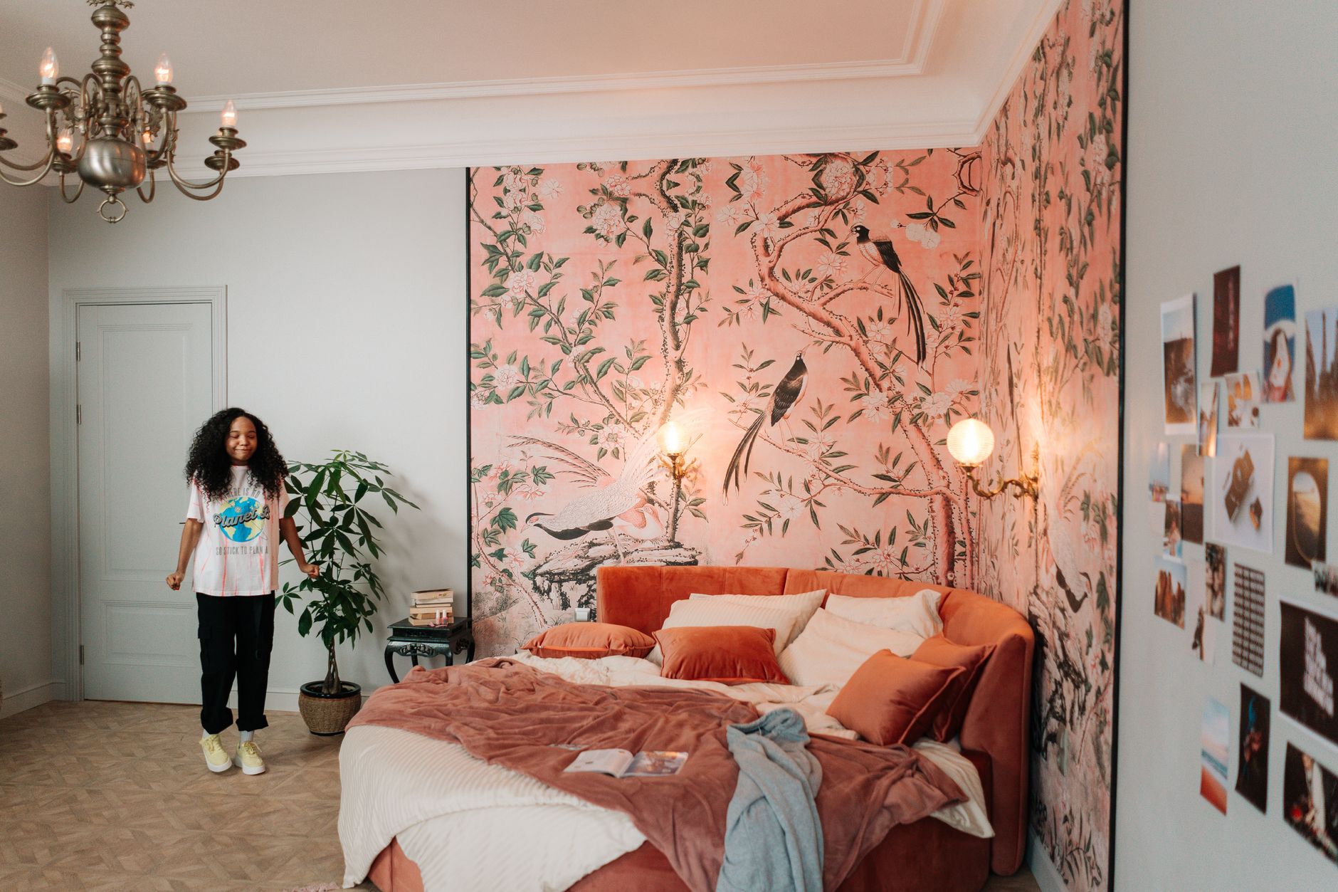
Feature wallpaper is one of those interior choices that photographs brilliantly or terribly, with almost nothing in between. A bold botanical print, a subtle linen texture, or a dramatic geometric repeat can anchor a room and give buyers a reason to stop scrolling. Get the shoot wrong, though, and the same wall reads as visual noise that makes the entire room feel smaller and harder to read. This guide covers the specific technical challenges patterned wallpaper presents and how Kitti Rivers Real Estate Photography approaches each one.
Why patterned wallpaper is genuinely difficult to shoot
The core problem is contrast. A high-contrast pattern like a dark botanical on a white ground creates brightness variations across a single wall. Standard metering reads the scene as an average and often underexposes the light sections or blows out the dark ones. A busy pattern also competes with the furniture, the ceiling, and the flooring for the viewer's eye, so if the framing isn't deliberate, the room looks chaotic rather than considered.
There's a second problem that catches photographers off guard: lens distortion at close range. Wide-angle lenses are the workhorse of property photography, but shoot a geometric or striped wallpaper from too close with too wide a focal length and the pattern bends noticeably at the edges of the frame. Buyers see the distortion before they notice anything else. If you're already thinking about wide-angle lenses for real estate photography and how focal length choices affect interiors, wallpaper rooms are where those decisions matter most.
The right focal length and shooting distance
Pull back as far as the room allows. A 24mm equivalent focal length on a full-frame sensor is usually the widest you want to go in a wallpapered room. A 28mm or 35mm equivalent is better if space allows, because it keeps the pattern geometry far more faithful to the eye. The extra compression also helps the wallpaper read as a deliberate design decision rather than an overwhelming graphic element.
Position the camera so the feature wall sits roughly parallel to the sensor plane. Even a slight rotation introduces keystoning into a geometric or striped pattern, and while vertical keystone is correctable in post, horizontal pattern distortion is harder to fix without warping the rest of the frame. A tripod is not optional here. A locked-off, level shot gives you a clean baseline for any correction work you need to do in editing. For the mechanics of tripod technique in situations exactly like this, the guide on using a tripod correctly for real estate photography is worth revisiting before the shoot.
Metering and exposure for high-contrast patterns
Spot metering on the midtone of the pattern is more reliable than evaluative or centre-weighted metering in patterned rooms. Pick a mid-grey or mid-value area of the design, lock exposure, and shoot from there. Bracket by half a stop either side regardless, because the repeat may shift the overall brightness as you move across the wall.
HDR blending is tempting but risky with patterned wallpaper. If the pattern has any fine detail, ghost artefacts from handheld movement between exposures create a smearing effect that's especially visible on sharp repeats like herringbone or fine stripes. If you're blending exposures, keep the camera absolutely locked on the tripod and use a remote shutter release.
Lighting: avoid raking light across the wall
Side-lit walls reveal texture. That's useful for a textured render or a linen weave, but it's destructive on a flat-printed wallpaper because it creates uneven brightness across the repeat. A raking window on one side of a feature wall will make the near half of the pattern look rich and the far half look washed out or shadowy.
Use a diffused flash or a bounce card to fill the wall evenly before adding any directional light. If the room has a ceiling light directly above, turn it on: even overhead light is more flattering to a repeating pattern than strong directional sources from one side. Watch for hotspots on vinyl or semi-gloss wallpapers; a slightly off-axis flash position reduces specular reflection without losing the fill.
Framing to show intent, not chaos
The strongest shots of feature wallpaper rooms give the eye somewhere to land that isn't the wall itself. A well-styled piece of furniture in the foreground, a lamp, a plant, or a styled shelf pulls focus and lets the wallpaper sit behind it as context rather than demand. This is the same principle that applies to dark or moody colour schemes: anchor the frame with something neutral or warm in the foreground, and the dramatic background reads as deliberate rather than oppressive.
Avoid shooting directly into a feature wall as the primary composition for every room image. One strong shot showing the full wall, and one or two wider shots where the wallpaper appears as a backdrop, gives editors and agents variety and prevents the pattern from fatiguing buyers who view the full gallery.
Colour accuracy in post
Wallpaper colours shift dramatically under different light sources, and the shift matters commercially. A dusty rose that reads correctly under daylight can shift towards salmon or grey under warm tungsten, and buyers who visit in person and see a different colour from the listing photos lose confidence. Shoot with a grey card or a colour checker in the frame on your first exposure, then use that as your white balance reference in Lightroom or Capture One before making any other adjustments.
Desaturation is a common post-processing mistake on patterned rooms. Pulling the saturation down to calm a busy wall reduces the very quality that makes the wallpaper a feature. Instead, use selective hue-saturation adjustments to control any individual colour that's reading as too aggressive, without flattening the overall palette.
When to include a detail shot
A detail crop of the wallpaper pattern itself, shot at a closer focal length, can be one of the most effective images in a listing gallery. It signals to buyers that the designers made deliberate, quality choices throughout the home. Frame the detail so at least one full repeat of the pattern is visible, and include a small section of the room context, such as a skirting board, a piece of furniture, or a light fitting, so the shot reads as editorial rather than disconnected.
Not every listing needs a detail shot. If the wallpaper is a subtle texture rather than a graphic pattern, the wide room shots will carry the message well enough. Save the detail crop for bold patterns that deserve their own moment in the gallery.
A note on dark or very saturated wallpapers
Deep navy, forest green, or charcoal wallpapers introduce the same exposure challenges as any dark interior, but with the added complexity of a pattern sitting within that dark field. Expose for the lighter elements of the pattern and let the dark ground sit slightly underexposed rather than pushing the exposure up to the point where the dark tones go muddy. A small amount of shadow lifting in post, applied carefully, recovers detail in the dark areas without flipping the contrast relationship between the pattern and the ground.
If the wallpaper is in a room that also has large windows, treat the window exposure separately from the wall exposure and blend the two shots. A dark patterned wall and a bright window in the same frame is a dynamic range problem the camera sensor can't solve in a single exposure, but a two-shot blend handles it cleanly.