
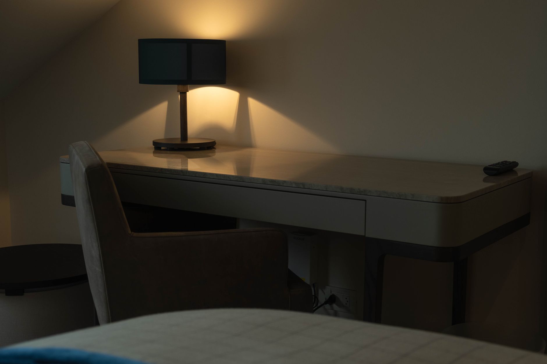
A study nook tucked into a shared room sits in an awkward middle ground. It's not a dedicated home office, so it doesn't get the same staging attention. It's not a decorative feature either, so sellers often leave it exactly as they use it: covered in cables, coffee rings, and expired calendars. When the photographer arrives, that corner becomes the thing the eye goes to first, and not in a good way.
Done well, a study nook in a bedroom or living area signals versatility. It tells buyers the home has thought about how people actually live. Done badly, it tells them the owners ran out of ideas in that corner. The difference between the two is almost entirely in preparation, not renovation.
Understand what the nook is competing against
In a shared room, the study nook has to justify its footprint. A bedroom with a built-in desk gives up wardrobe space or floor area. A living room with a study alcove borrows from the social zone. Buyers notice that trade-off, and your styling has to make the case that the nook earns its place.
The goal isn't to disguise the nook. It's to present it as an asset. That means the styling needs to answer one question clearly: what could I do here? If the answer is obvious from the photo, the nook reads as a feature. If it's ambiguous or cluttered, it reads as dead space.
It also helps to think about this alongside how to style a spare room that has no obvious purpose. The principle is the same: give the space a legible identity before the camera arrives, and buyers will project themselves into it.
Clear the desk completely, then rebuild from scratch
Start with a completely empty surface. Remove everything: the monitor if it's not fixed, the keyboard tray, the charging cables, the stack of notebooks, the takeaway coffee cups and the kids' schoolwork. A bare desk looks better than a busy one every single time, even if the bare desk feels wrong to you in daily life.
Once the surface is clear, bring back exactly three things. A closed notebook or journal. A single pen or pencil in a simple holder. One small object with visual weight, such as a ceramic pot, a low plant, or a single hardcover book set at an angle. That's it. Three items, all intentional, none of them personal.
The chair matters too. Tuck it in so the legs disappear under the desk. If the chair is an old mesh office chair with torn armrests, swap it for a dining chair, a bentwood stool, or anything that doesn't look like it came from a liquidation sale. A good chair at a desk signals quality without spending much.
Manage the cables before the photographer arrives
Nothing ages a space faster in a listing photo than a tangle of power cables. If the monitor stays in shot, the cable must be hidden or at least bundled flat against the wall. Use a strip of black gaffer tape to hold it against the skirting board out of frame. Run the power board behind the desk or into a drawer. If there's a USB hub visible, remove it entirely.
Wireless peripherals are worth borrowing for a single shoot day if you don't own them. A keyboard and mouse without cables in frame makes a desk feel modern even if the underlying furniture is ten years old. It's a small detail that reads immediately in a wide shot.
Use lighting to separate the nook from the rest of the room
A study nook that shares a room with a bed or sofa needs its own light source to read as distinct in a photograph. A desk lamp does this work efficiently. It doesn't need to be switched on for the photo, but it needs to be there: it signals that the space is designed for focused use, not just overflow storage.
If the room already has strong natural light, position the desk so that light falls across the work surface from the side rather than from behind the monitor. Side light on a desk looks purposeful. Back light blows out the wall behind and flattens the whole corner.
Kitti Rivers Real Estate Photography uses supplemental lighting in shared rooms specifically to give each zone its own tonal identity. When the study nook has slightly warmer, more focused light than the rest of the bedroom, it reads as a feature in the final image rather than a leftover corner.
Style the wall above the desk deliberately
A blank wall above a desk is a missed opportunity. You don't need to hang a gallery. One framed print at eye level, centred above the workspace, gives the nook a clear visual anchor and makes it look considered rather than incidental.
Avoid motivational typography prints. They read as filler. A simple abstract, a botanical illustration, or a black-and-white photograph works in almost any context. The frame matters as much as the image: a thin black or brushed brass frame sits well in contemporary interiors; a white frame works in lighter, Scandi-influenced spaces.
A small floating shelf above the desk can also work if the room has the ceiling height for it. Put two or three objects on the shelf, nothing larger than 20 centimetres, and leave space between them. A shelf that's packed to the edges reads as storage, not styling.
Consider how the nook reads in the wider room shot
Most photographers will shoot the room as a whole before they move in for a detail shot of the nook. That means the desk needs to look good from 3 to 4 metres away as well as up close. Step back and look at it from the doorway. If the nook disappears into the room, add one element of contrast: a deeper wall colour behind the desk if the room is light, or a lighter task lamp if the room is dark.
If the nook is in a bedroom, make sure the desk styling doesn't fight the bed for attention. The bed is the hero shot. The desk should support the story of the room, not compete with it. Keep the desk palette within the same tones as the bedding and soft furnishings so it reads as cohesive. For a broader look at how these rooms come together before a shoot, the guide on how to style a bedroom that photographs well and sells covers the layering decisions that affect the whole room, desk included.
What to avoid
Skip personal photographs, children's drawings, and bills on the pinboard. Remove any branded merchandise, corporate stationery, and anything with a name or address on it. Buyers need to imagine themselves at that desk, not feel like they're borrowing someone else's workspace.
Don't over-style the nook with too many plants. One small succulent is fine. Three pots of trailing pothos turns a desk into a greenhouse corner and distracts from the functionality of the space.
Avoid putting the monitor at an angle to look casual. A monitor sitting crooked on a desk looks like the owner was interrupted mid-meeting. Either centre it, push it to the very back of the desk, or remove it entirely and shoot the desk as a clean writing surface.
The return on a well-styled nook
Buyers searching for a property with a workspace often filter on that feature specifically. A study nook that reads clearly in listing photos means your property appears in those searches and holds up when buyers arrive in person. A nook that looks like afterthought storage in photos means buyers mentally subtract square metres, even if the floor plan says otherwise.
The effort required is two to three hours of focused preparation. That's a low cost for a feature that can shift how a buyer perceives the value of the entire room.