
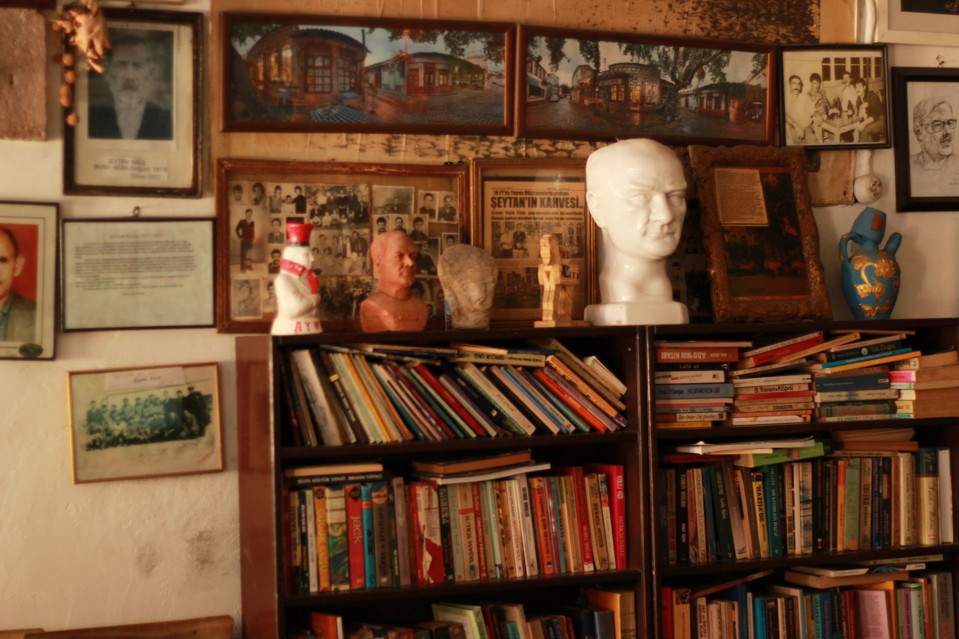
A bookshelf wall or home library is the kind of feature that stops buyers mid-scroll. It signals character, permanence, and a certain quality of life that most rooms simply can't convey. Yet most sellers treat it as background furniture, leaving it cluttered, chaotic, or so densely packed that the camera picks up nothing but spines. Style it with intention and it becomes one of the strongest images in the listing. Leave it unstyled and it becomes visual noise.
Why bookshelf walls are harder to style than they look
The challenge with a bookshelf wall is density. A camera compresses depth and flattens contrast, which means a shelf that looks rich and interesting to the eye can read as a blurry wall of colour in a photo. The goal isn't to make it look sparse. It's to create enough visual rhythm and breathing room that the camera can actually see what's there.
Colour is the first problem most sellers encounter. Personal book collections tend to be sorted by author or accumulated at random, which produces clashing spines and no coherent palette. Professional stylists don't rearrange by Dewey decimal. They rearrange by colour, breaking the shelf into loose tonal groupings that hold together in an image.
Editing the shelves before the photographer arrives
Start by pulling everything off. Every shelf, every object, every framed photo. Put it all on the floor and treat what goes back as a deliberate selection, not a restoration.
Books stay, but not all of them. Remove anything with a busy, jarring spine: fluorescent paperback covers, aggressively branded textbooks, and any title you wouldn't want a stranger to read. Group what remains into rough colour families: blues and greens together, neutrals and creams together, warm reds and terracottas together. You don't need perfect graduation. You need enough tonal consistency that each section reads as a unit rather than a jumble.
Lay some books horizontally. A stack of 3 to 5 books placed flat on a shelf, with a small object resting on top, creates an instant change of rhythm that breaks the monotony of upright spines. Don't overdo it. One or two horizontal stacks per unit is enough.
What to place alongside the books
Empty space is your friend. Pull books back from the front edge of each shelf so there's a small gap between the spine and the shelf lip. This depth creates shadow, and shadow creates dimension in a photograph. A shelf crammed flush to the edge looks flat. One set back slightly looks substantial.
Objects add life, but the wrong ones add clutter. The right objects for a bookshelf in a listing photo are things that are matte, neutral or earthy in tone, and simple in silhouette. A ceramic vessel, a small sculpture, a smooth river stone, a low trailing plant. Things that photograph as shapes rather than labels. Remove anything branded, plastic, or reflective. Glass trophies, branded mugs, and novelty figurines all catch light in ways that distract.
Plants are worth the effort. A trailing pothos or small-leafed ivy placed at the end of a shelf introduces organic texture that no book spine can replicate. Keep it small and contained. A plant that spills onto the books reads as neglect. One that sits cleanly at a shelf edge reads as considered.
Lighting a bookshelf wall for photography
Bookshelf walls are usually positioned on interior walls, away from windows, which makes them naturally dark. A dark bookshelf in a listing photo looks heavy and uninviting, even if the room around it is well lit.
Integrated shelf lighting, such as LED strip lights fitted to the underside of each shelf, makes a genuine difference. If the property already has this, make sure every globe is working and warm in colour temperature. Cool or daylight-temperature shelf lighting looks clinical rather than inviting. If there's no integrated lighting, a table lamp or floor lamp positioned close to one side of the shelving unit can throw enough light across the shelves to lift the shot. Kitti Rivers Real Estate Photography positions supplementary lighting to skim across bookshelf surfaces rather than light them head-on, which preserves texture and depth rather than washing it out.
For broader guidance on how artificial and natural light interact in a listing shoot, the approach to flash vs. ambient light in real estate photography applies directly to bookshelf walls and any other dark interior feature.
Styling a full home library room
A dedicated home library room needs all of the above plus a spatial anchor. The shelving is the feature, but the camera needs something in the foreground to establish scale and invite the viewer in. A leather or linen armchair positioned at an angle to the shelves does this cleanly. Add a floor lamp behind the chair, a small side table with a single book placed open or face-down, and you've constructed a composed vignette that communicates "this is a room you want to sit in."
Keep the floor clear. A rug can ground the space, but it should be simple in pattern and muted in tone. A heavily patterned rug under a heavily loaded bookshelf competes for attention and the photo tries to resolve both at once. One strong focal point per image is always the better outcome.
If the home library doubles as a study, treat the desk as a secondary feature and style it accordingly: one notebook, one pen, a small lamp, nothing else. The same logic applies as for styling a home office for property photos: the desk should communicate purpose without communicating the specific work of the person who used it.
Common mistakes to fix before the shoot
These are the four things Kitti Rivers Real Estate Photography sees most often on bookshelf walls in property shoots, and they're all fixable in under an hour.
- Too many small objects. Five or more small items on a single shelf create a display that reads as a collection in the room but photographs as clutter. Reduce each shelf to a maximum of 2 decorative objects alongside the books.
- Photos and personal memorabilia. Family photos on shelves introduce faces and identities that pull a buyer out of the "I could live here" headspace. Remove them entirely.
- Broken rows. A shelf with books at one end and a large empty gap at the other looks unfinished. If the collection doesn't fill a shelf, consolidate it or fill the gap with a stack of books on their side.
- Mixed materials at the front edge. Books flush with the edge next to an object sitting 10cm back creates a ragged front line. Align the front edges of books and objects on the same plane, then use depth variation only in the back half of the shelf.
How this fits into your broader styling preparation
A bookshelf wall is just one room feature. The same methodical approach to editing, grouping by colour, controlling depth, and reducing objects applies across every space in the home. For a broader framework that covers the whole property before the photographer arrives, the decluttering guide for property sale sets out a room-by-room process that covers what to remove, what to store, and what to leave in place.
A well-styled bookshelf wall won't sell a home on its own. But it is the kind of image that buyers send to each other, screenshot and save, and remember when they're deciding which properties to inspect. That's a disproportionate return for a morning's work.